ウィジェットをフェードインおよびフェードアウトする
UI 開発者は多くの場合、画面上の要素を表示したり非表示にしたりする必要があります。 ただし、要素を画面上または画面外にすばやくポップすると、 エンドユーザーにとって不快に感じます。その代わり、 不透明アニメーションを使用して要素をフェードインおよびフェードアウトして作成します スムーズな体験。
のAnimatedOpacityウィジェットを使用すると不透明度を簡単に実行できます
アニメーション。このレシピでは次の手順を使用します。
- フェードインおよびフェードアウトするボックスを作成します。
- を定義します
StatefulWidget。 - 表示/非表示を切り替えるボタンを表示します。
- ボックスをフェードインおよびフェードアウトします。
1. フェードインおよびフェードアウトするボックスを作成する
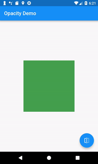
まず、フェードインおよびフェードアウトするものを作成します。この例では、 画面上に緑色のボックスを描画します。
Container(
  width: 200,
  height: 200,
  color: Colors.green,
)
2. を定義します。StatefulWidget
これでアニメーション化する緑色のボックスができました。
ボックスを表示すべきかどうかを知る方法が必要です。
これを実現するには、StatefulWidget。
あStatefulWidgetを作成するクラスですState物体。
のStateオブジェクトはアプリに関するデータを保持し、次の方法を提供します。
そのデータを更新します。データを更新する際には、
Flutter にこれらの変更を加えて UI を再構築するよう依頼することもできます。
この場合、データは 1 つあります。 ボタンが表示されるかどうかを表すブール値。
を構築するにはStatefulWidget、次の 2 つのクラスを作成します。StatefulWidgetそして対応するStateクラス。
プロのヒント: Android Studio および VSCode の Flutter プラグインには次のものがあります。
のstfulスニペットを使用して、このコードをすばやく生成します。
// The StatefulWidget's job is to take data and create a State class.
// In this case, the widget takes a title, and creates a _MyHomePageState.
class MyHomePage extends StatefulWidget {
  final String title;

  const MyHomePage({
    super.key,
    required this.title,
  });

  @override
  State<MyHomePage> createState() => _MyHomePageState();
}

// The State class is responsible for two things: holding some data you can
// update and building the UI using that data.
class _MyHomePageState extends State<MyHomePage> {
  // Whether the green box should be visible.
  bool _visible = true;

  @override
  Widget build(BuildContext context) {
    // The green box goes here with some other Widgets.
  }
}
3. 表示/非表示を切り替えるボタンを表示します。
これで、緑色のボックスが正しいかどうかを判断するためのデータが得られました。 が表示されるはずなので、そのデータを更新する方法が必要です。 この例では、ボックスが表示されている場合は非表示にします。 ボックスが非表示の場合は表示します。
これに対処するには、ボタンを表示します。ユーザーがボタンを押すと、
ブール値を true から false、または false から true に反転します。
この変更を行うには、setState()、
これは、Stateクラス。
これにより、Flutter にウィジェットを再構築するように指示されます。
ユーザー入力の操作の詳細については、 を参照してくださいジェスチャー料理本のセクション。
FloatingActionButton(
  onPressed: () {
    // Call setState. This tells Flutter to rebuild the
    // UI with the changes.
    setState(() {
      _visible = !_visible;
    });
  },
  tooltip: 'Toggle Opacity',
  child: const Icon(Icons.flip),
)
4. ボックスをフェードインおよびフェードアウトします
画面上に緑色のボックスと、表示/非表示を切り替えるボタンがあります。
にtrueまたfalse。ボックスをフェードインおよびフェードアウトするにはどうすればよいですか?とAnimatedOpacityウィジェット。
のAnimatedOpacityウィジェットには 3 つの引数が必要です。
-
opacity: 0.0 (非表示) ~ 1.0 (完全に表示) の値。 -
duration: アニメーションが完了するまでにかかる時間。 -
child: アニメーション化するウィジェット。この場合は緑色のボックスです。
AnimatedOpacity(
  // If the widget is visible, animate to 0.0 (invisible).
  // If the widget is hidden, animate to 1.0 (fully visible).
  opacity: _visible ? 1.0 : 0.0,
  duration: const Duration(milliseconds: 500),
  // The green box must be a child of the AnimatedOpacity widget.
  child: Container(
    width: 200,
    height: 200,
    color: Colors.green,
  ),
)
インタラクティブな例
import 'package:flutter/material.dart';

void main() => runApp(const MyApp());

class MyApp extends StatelessWidget {
  const MyApp({super.key});

  @override
  Widget build(BuildContext context) {
    const appTitle = 'Opacity Demo';
    return const MaterialApp(
      title: appTitle,
      home: MyHomePage(title: appTitle),
    );
  }
}

// The StatefulWidget's job is to take data and create a State class.
// In this case, the widget takes a title, and creates a _MyHomePageState.
class MyHomePage extends StatefulWidget {
  const MyHomePage({
    super.key,
    required this.title,
  });

  final String title;

  @override
  State<MyHomePage> createState() => _MyHomePageState();
}

// The State class is responsible for two things: holding some data you can
// update and building the UI using that data.
class _MyHomePageState extends State<MyHomePage> {
  // Whether the green box should be visible
  bool _visible = true;

  @override
  Widget build(BuildContext context) {
    return Scaffold(
      appBar: AppBar(
        title: Text(widget.title),
      ),
      body: Center(
        child: AnimatedOpacity(
          // If the widget is visible, animate to 0.0 (invisible).
          // If the widget is hidden, animate to 1.0 (fully visible).
          opacity: _visible ? 1.0 : 0.0,
          duration: const Duration(milliseconds: 500),
          // The green box must be a child of the AnimatedOpacity widget.
          child: Container(
            width: 200,
            height: 200,
            color: Colors.green,
          ),
        ),
      ),
      floatingActionButton: FloatingActionButton(
        onPressed: () {
          // Call setState. This tells Flutter to rebuild the
          // UI with the changes.
          setState(() {
            _visible = !_visible;
          });
        },
        tooltip: 'Toggle Opacity',
        child: const Icon(Icons.flip),
      ),
    );
  }
}